Case study · Vex Clothes · Late 2023 – 2025
Vex
A second-hand fashion marketplace with a TikTok-style discovery feed. I co-founded it and took it from research to the App Store, where it has more than 1,000 active users.
- 1st placeIncuba TEC, Incuba UDD, 2025
- 1,000+active users, live on the App Store
- 0 → 1from validation to a shipped app
Context
Across Latin America, second-hand fashion is traded every day on Instagram posts, disappearing stories, WhatsApp chats and meet-ups. Demand is large, but the experience runs on tools that were never built for commerce.
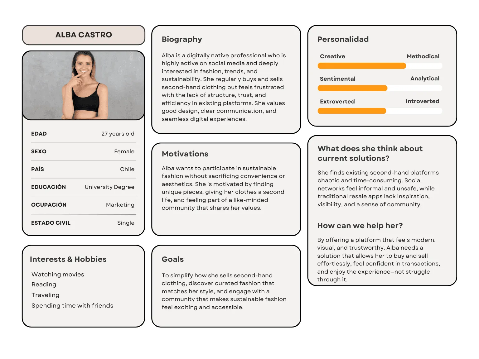
Buyers struggle to trust what they see. Sellers lose time answering the same questions and watch their posts disappear from feeds. Stores can’t put their stock online one item at a time. Vex set out to make buying and selling second-hand feel as easy and as desirable as buying new.
I co-founded Vex and owned product design and research. My co-founder, the CTO, led engineering. We completed the app in 2024. It is live on the App Store with more than 1,000 active users.
Research
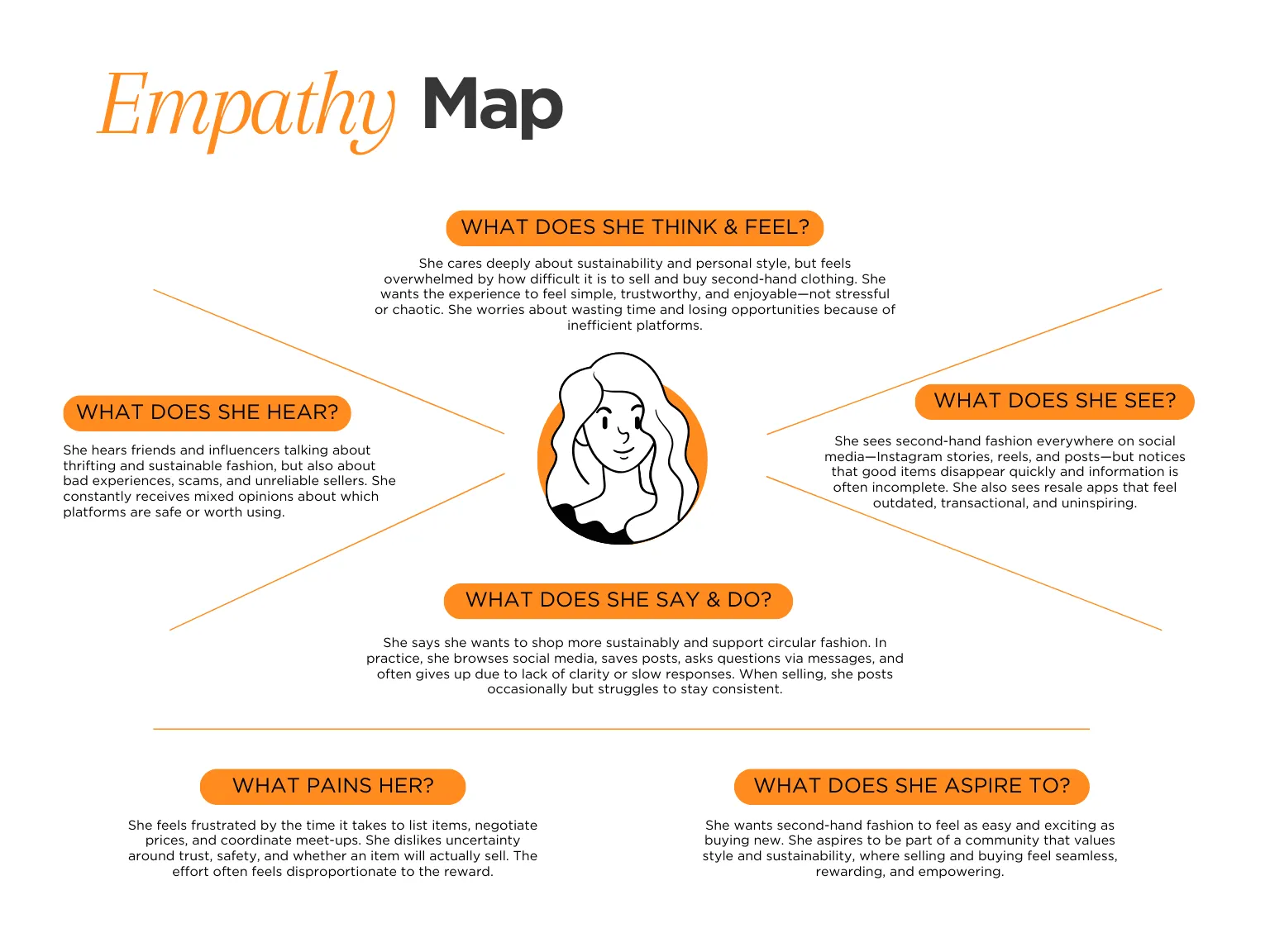
We interviewed and ran focus groups with buyers, casual sellers and second-hand store owners, and reviewed the existing options. They split into two camps:
- Social platforms, with high engagement but a lot of friction to actually buy or sell.
- Resale marketplaces, with less friction but a transactional, uninspiring experience.
None combined speed, trust and visual discovery in one place.
From the research we defined three problems to design for: complexity (too many manual steps to buy or sell), trust (confidence depended entirely on personal judgement) and scale (informal selling works one item at a time, then breaks down).
Key decisions
Decision 01
A discovery feed, not a catalogue
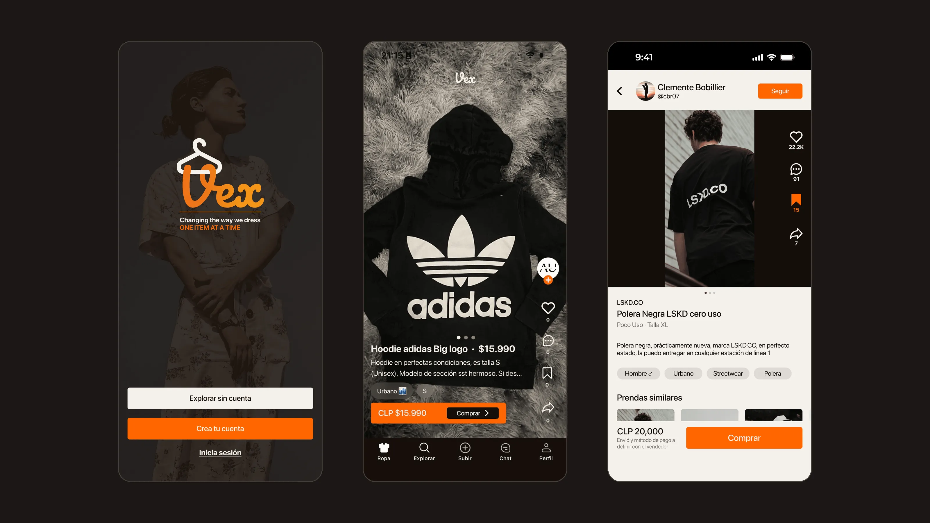
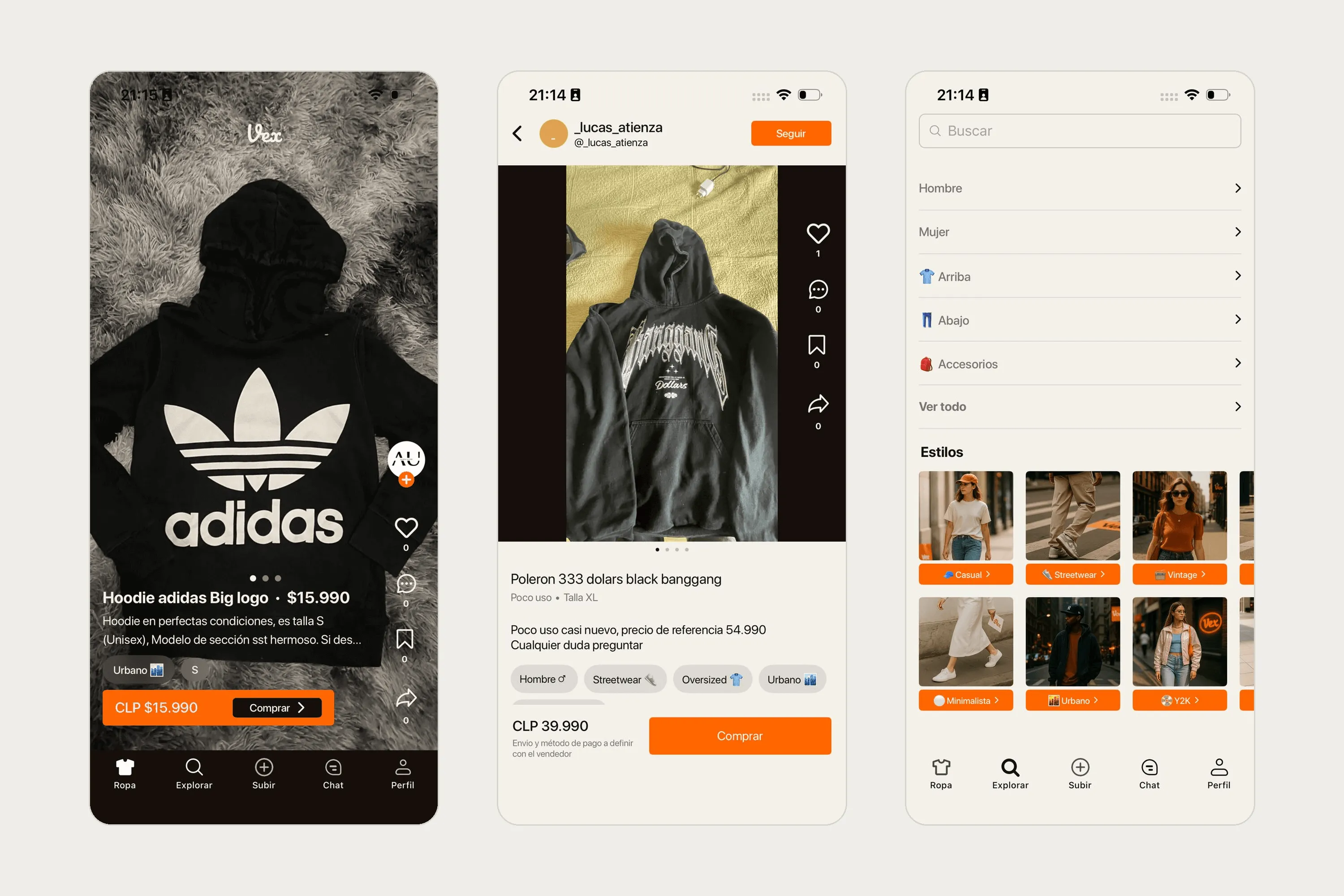
Second-hand fashion couldn’t look like a classifieds site. We designed the home as a TikTok-style discovery feed, drawing on social platforms and fashion editorials instead of e-commerce, so browsing felt aspirational and social.
The feed kept garments and people’s own photos at the centre of the screen, with the transactional actions one tap away.
Decision 02
Design for sellers first
Two-sided marketplaces have a cold-start problem: buyers don’t come without stock, and sellers don’t list without buyers. We focused design effort on the supply side first, making listing a garment as fast as possible, so inventory would bring buyers.
Decision 03
Progressive onboarding, after testing it with users
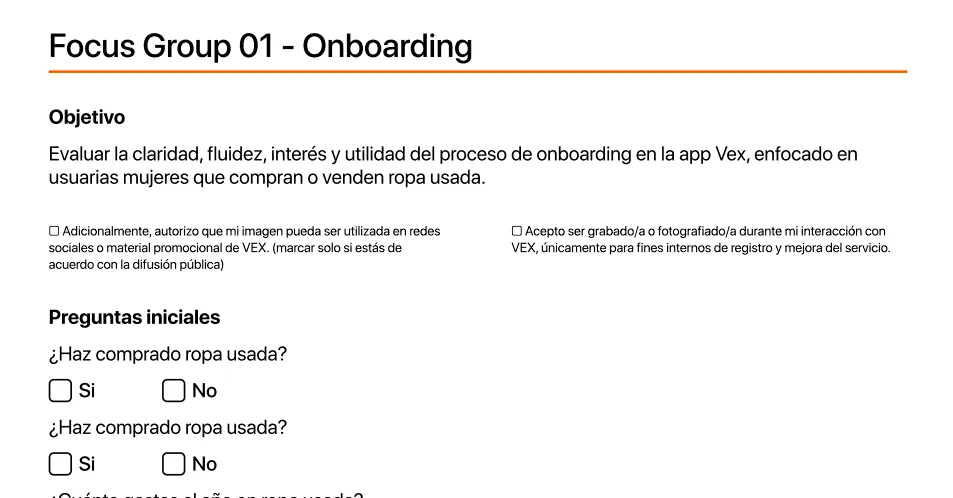
We tested onboarding in focus groups of six. People were interested, but very sensitive to effort:
- 4 of 6 felt asked for too many decisions too soon. We moved detailed preferences later.
- 4 of 6 didn’t see their style or brands in the options. We added more and signalled that recommendations improve over time.
- 3 of 6 asked why some personal data was needed. We added a short explanation of why.
- 4 of 6 weren’t motivated by the final screen. We designed a clearer activation moment with an obvious next step.
Decision 04
Build trust into the product
We first assumed Vex’s value was “cool fashion”. Users told us otherwise: they left because of uncertainty, not aesthetics. In a peer-to-peer marketplace, trust is the product, so we prioritised verified profiles, ratings and secure payments over visual polish.
Validation
I ran moderated usability tests with a clickable high-fidelity prototype, at Universidad del Desarrollo and with target users: people who buy second-hand, casual resellers and first-timers interested in sustainable fashion. Two findings shaped the final app:
- Visual clarity builds trust fast. A strong hierarchy and the familiar feed format helped people understand the platform within seconds.
- Effort in onboarding costs motivation. Each extra early decision lowered momentum toward the first purchase or listing.
Outcome
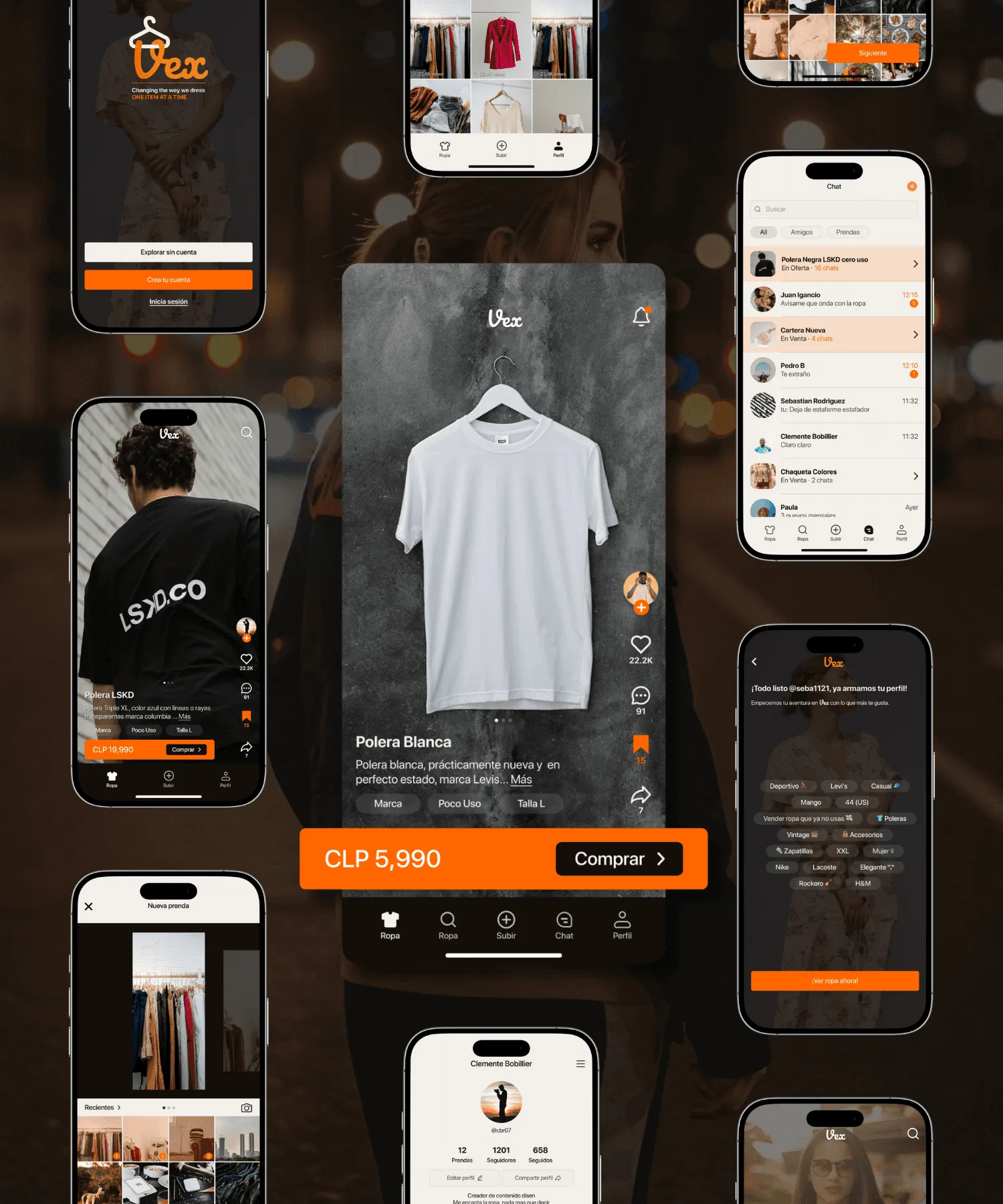
- We completed the app in 2024. It is live on the App Store with more than 1,000 active users.
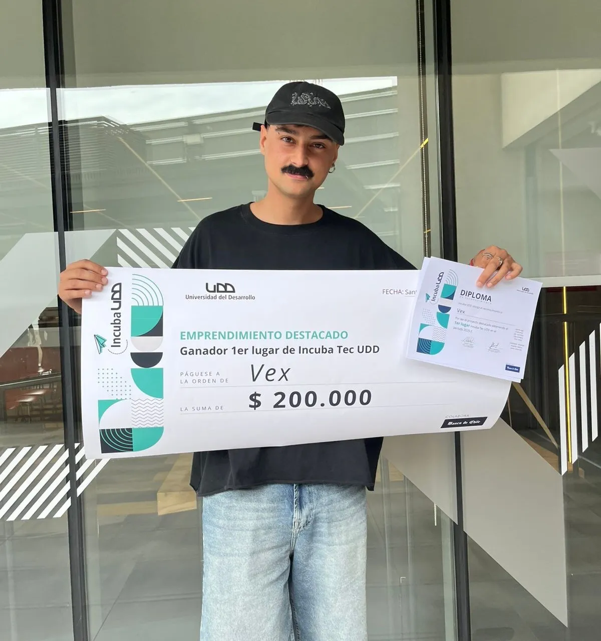
- Vex won first place at Incuba TEC (Incuba UDD, Santiago) in the second semester of 2025.
What I learned
- Speed is a feature. We over-debated pixel placement early on. Shipping a good-enough feature to real users taught us more than any design critique.
- Designer and engineer as one unit. Working side by side with the CTO, I learned to design with technical feasibility in mind: data structures, API limits and shared components.
- Mechanics before polish. Solving the cold-start problem taught me to use product mechanics to solve business problems, not only to delight users.